Research and Empathize
I started my research by exploring Kroger customer statistics to gain a better understanding of their app users.
.svg)
Bashir, U. (2024, October 24). People who regularly shopped at Kroger in the U.S. , by age 2024. Statista. https://www.statista.com/forecasts/228442/people-in-household-that-bought-most-of-their-groceries-at-kroger-usa
To gain a deeper and more personal understanding of the user experience, I interviewed several participants (people I know who frequently use grocery apps) across different age ranges and levels of technological ability. This helped me empathize with my target users and better understand their pain points.
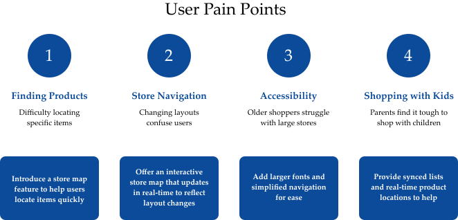
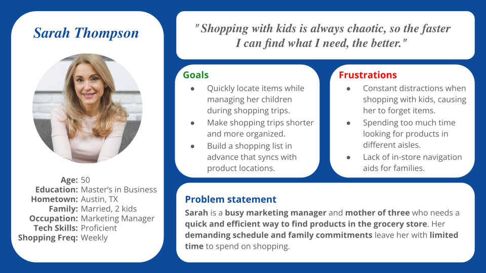
.svg)
.svg)
Ideate
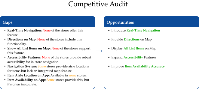
Once I gathered enough information about my users, I began brainstorming through design exercises like "How Might We" and Crazy 8's. I also conducted further research on Kroger's direct and indirect competitors, their branding, app reviews, and business goals to ensure the redesign conveyed their message while enhancing the app's design.
.avif)
The Designs
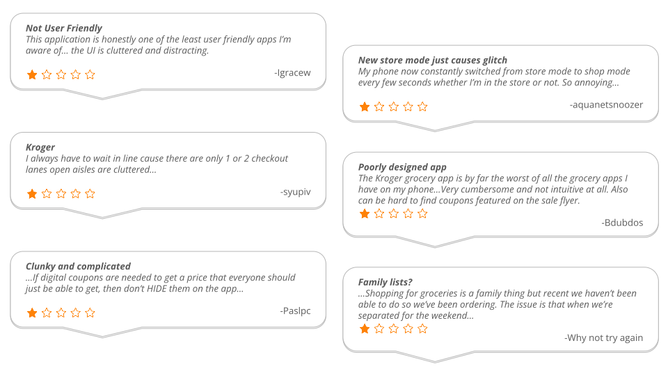
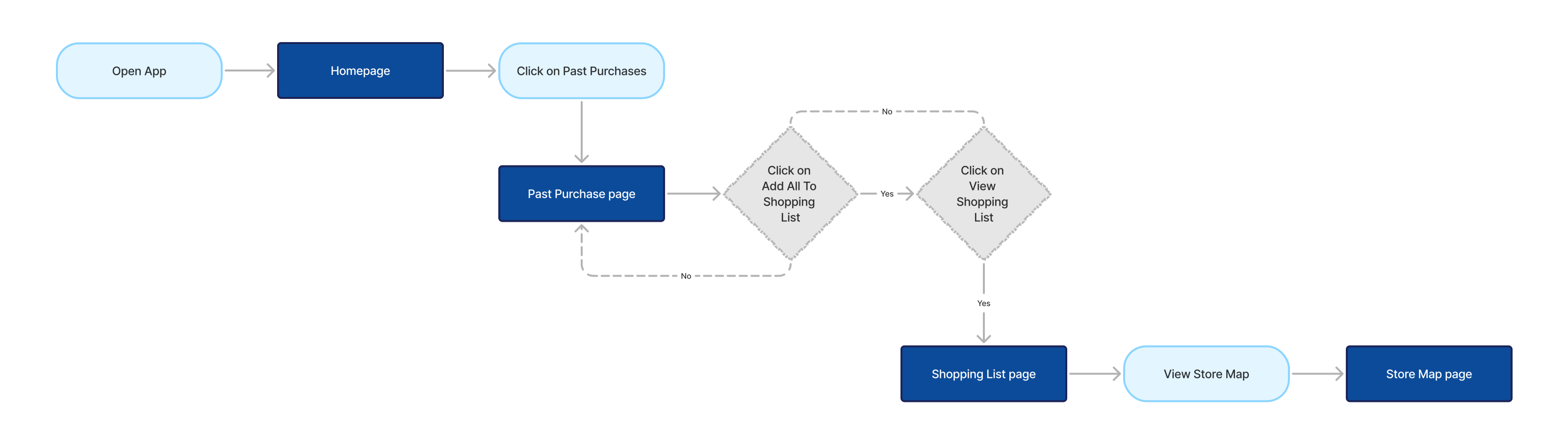
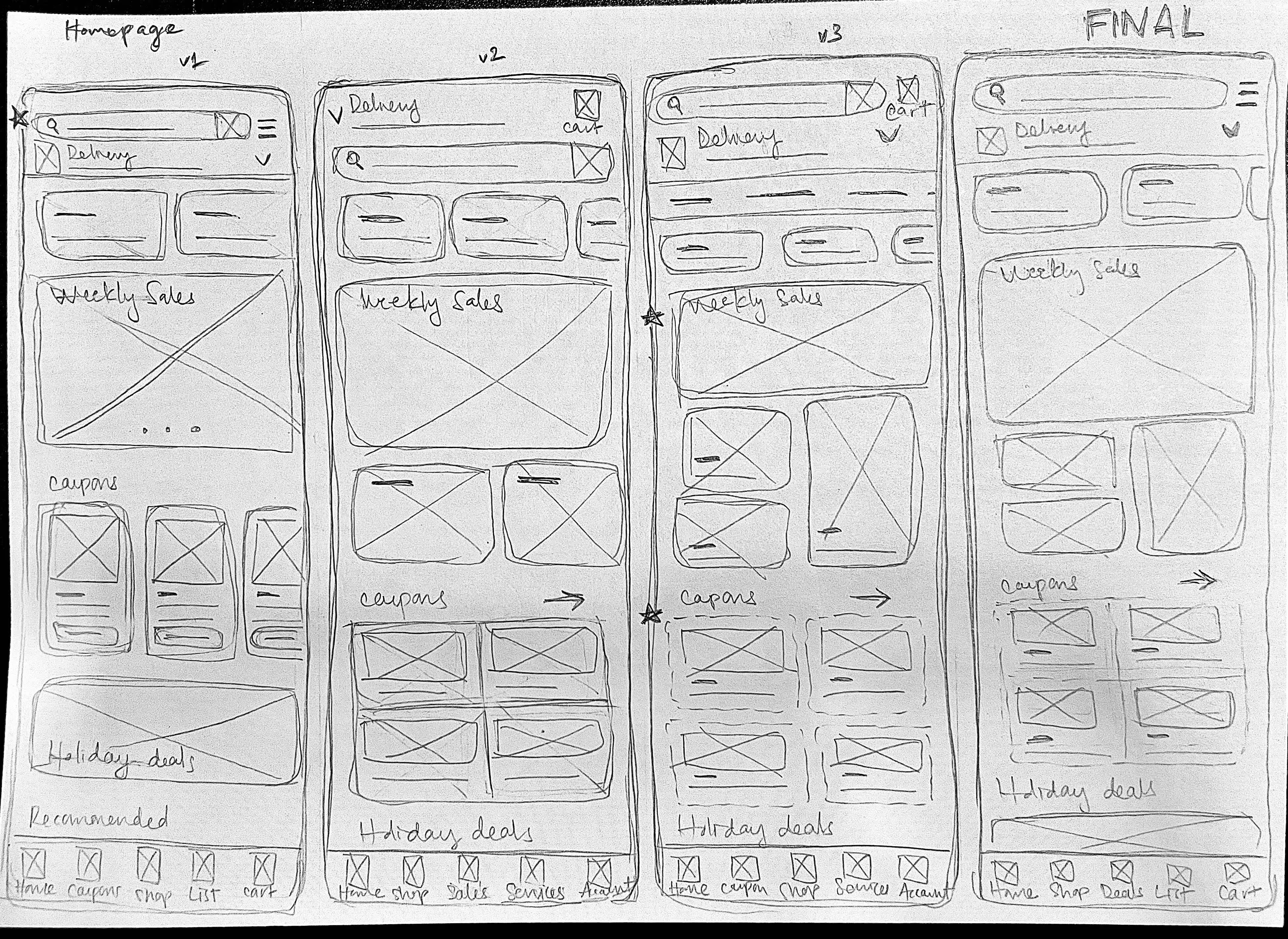
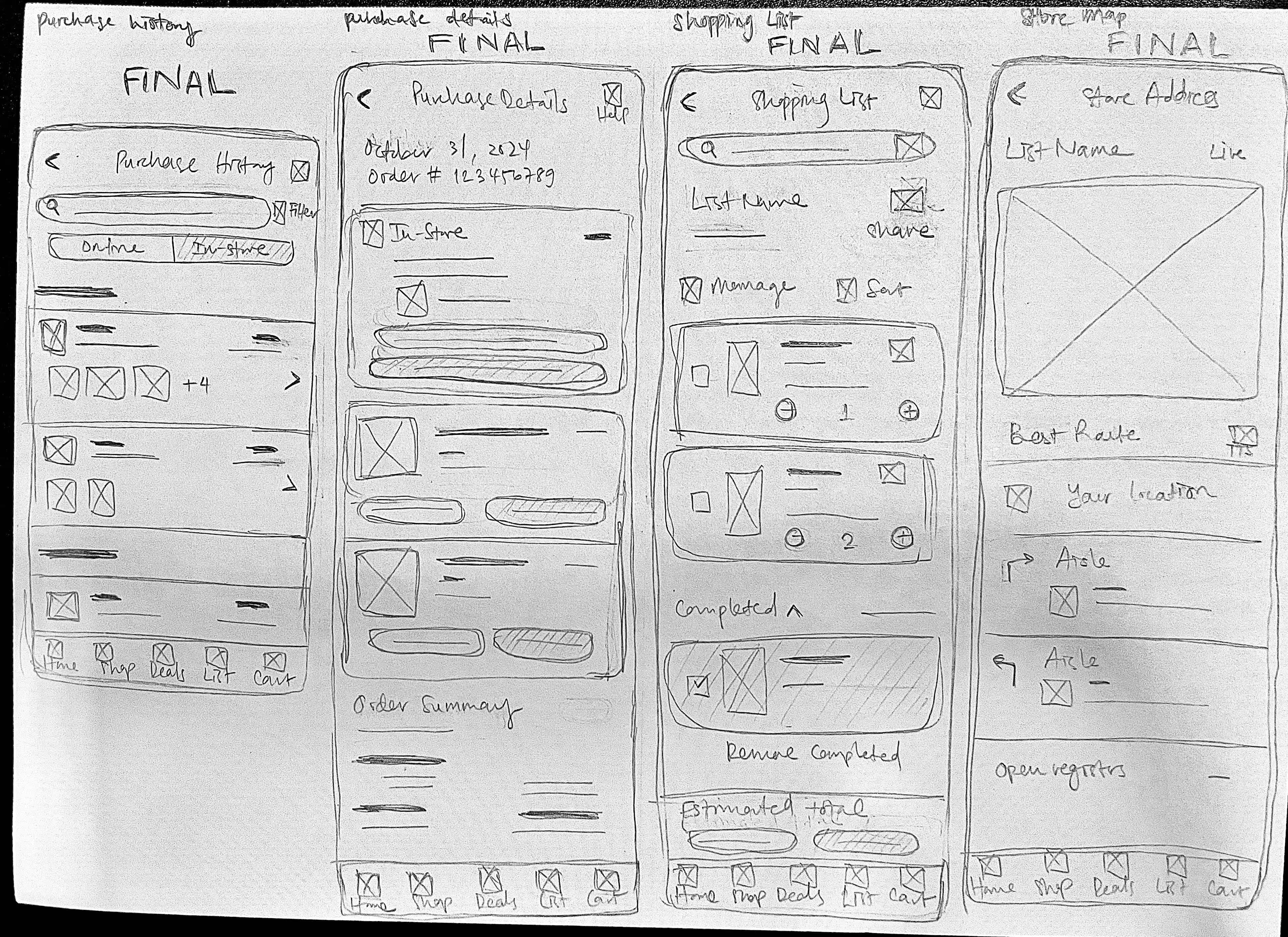
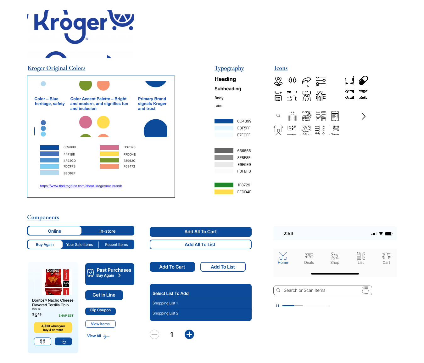
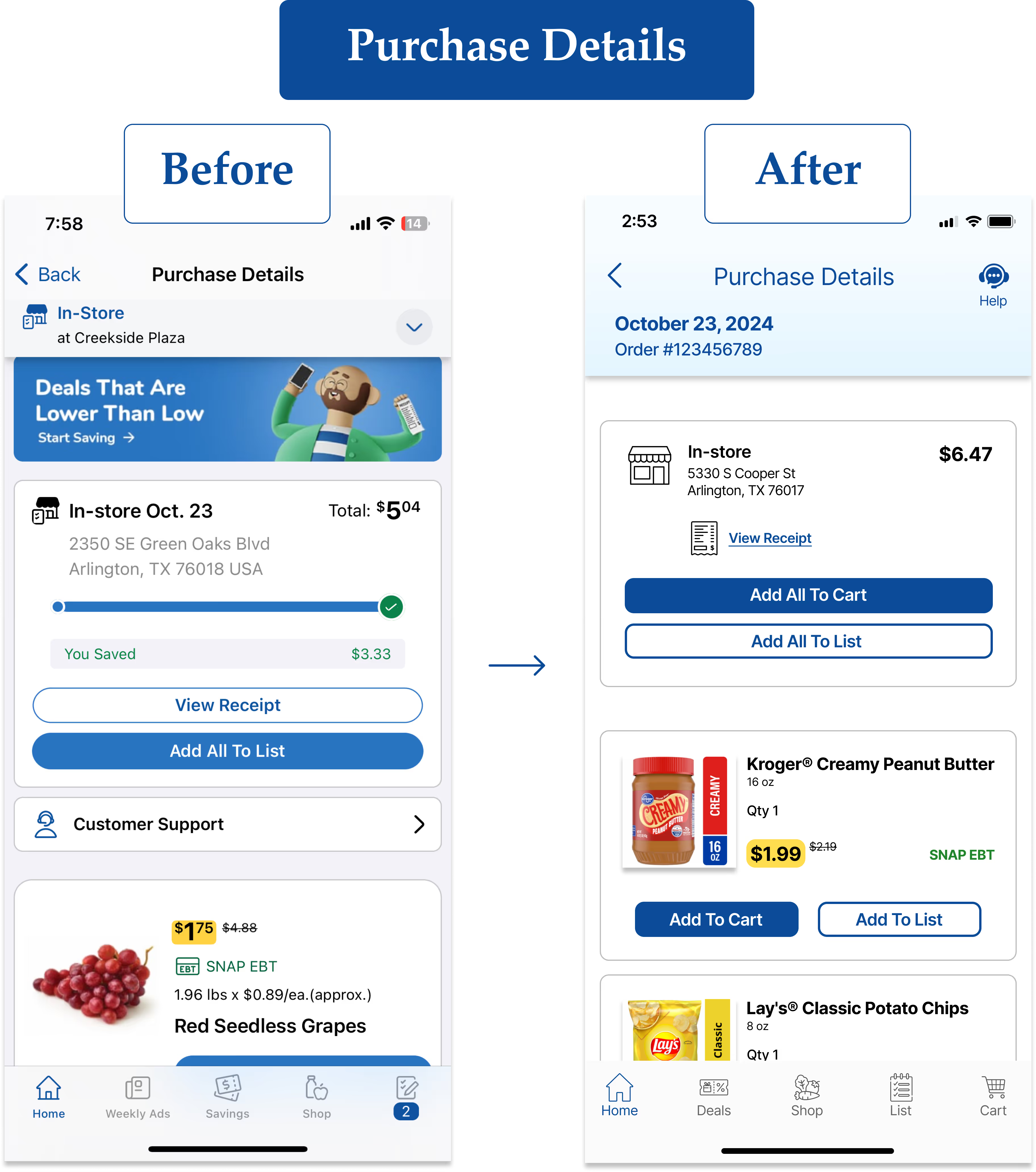
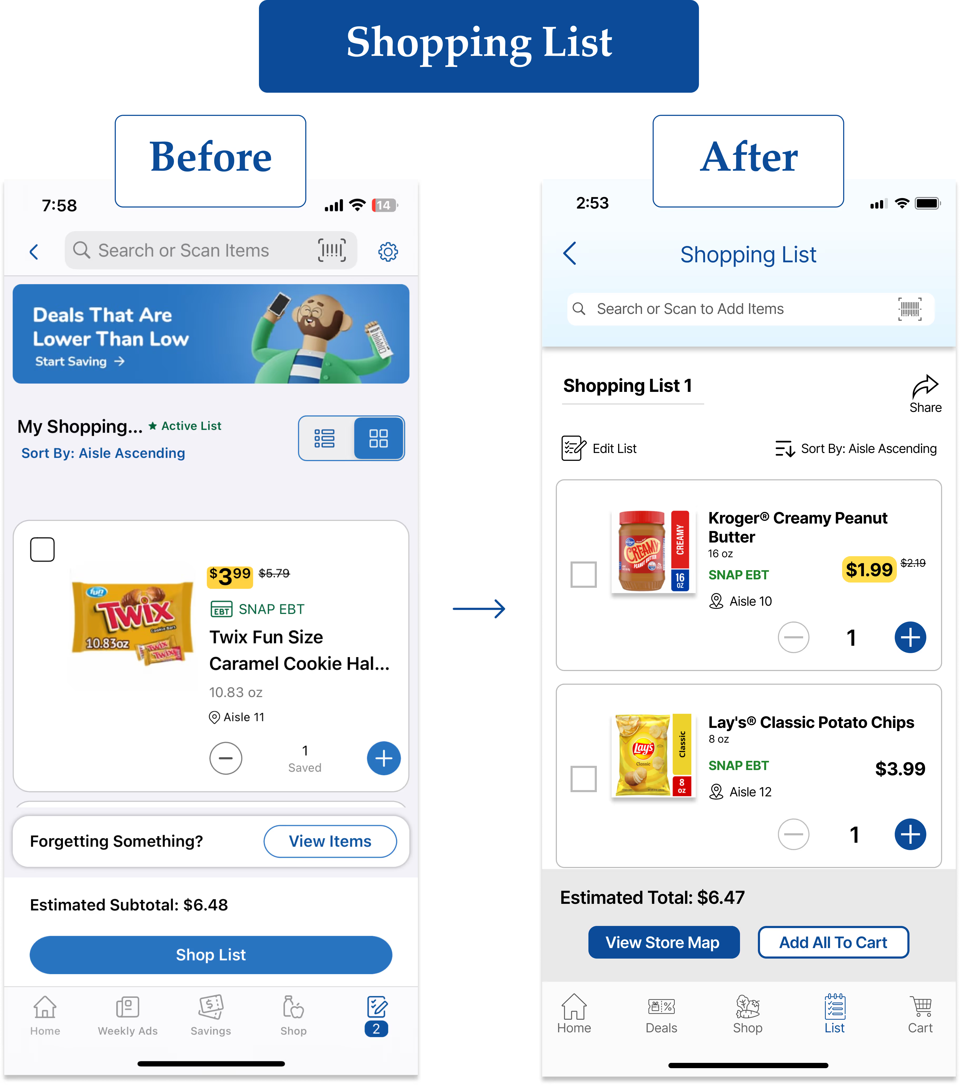
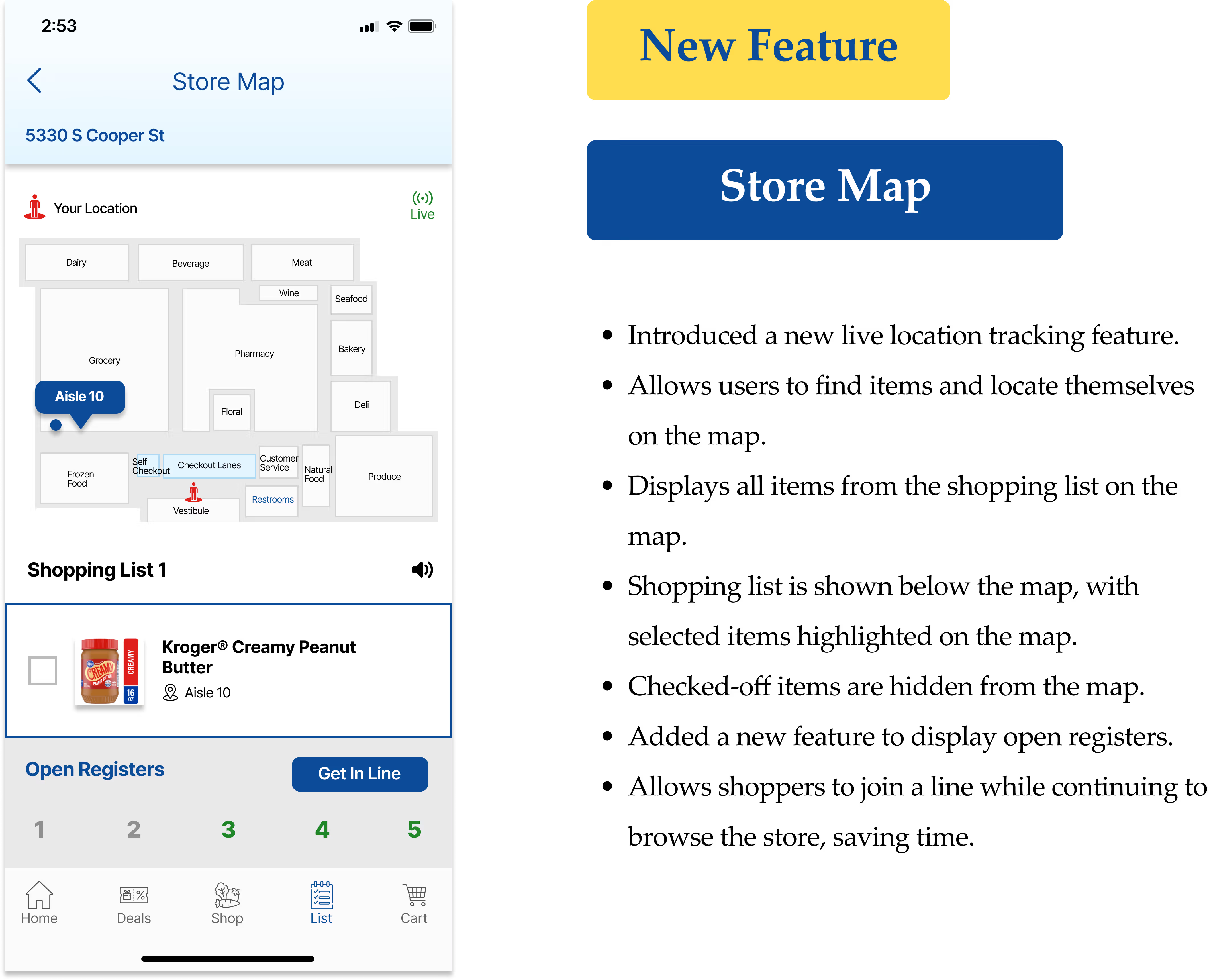
I aimed to give the app a fresh, modern look that aligns with the brand's identity. To evoke nostalgia for older users, I incorporated design elements inspired by physical items from the past, such as paper coupons. The goal was to create a design that feels familiar, yet remains simple and easy to use. Since I was both redesigning the app and introducing a new feature, I also reviewed user feedback on the App Store to identify other pain points and opportunities for improvement. This helped me uncover issues in the current design and find ways to enhance the user experience.
.svg)
.avif)
Side-by-Side
.avif)
.avif)
Usability Testing
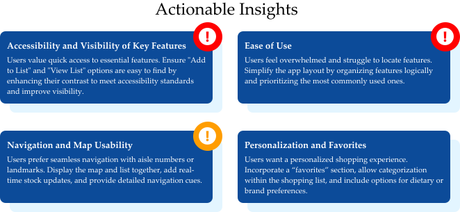
Between the lo-fi and hi-fi stages, I conducted usability testing to gather feedback and ensure that my design and structure were intuitive and user-friendly. I organized participant feedback using affinity mapping, which helped identify themes and inform actionable insights for improvement. Additionally, I focused on accessibility by ensuring text readability and contrast, simplifying navigation with prominent buttons, and adding support for voice assistance. After completing the hi-fi stage, I iterated multiple times based on additional feedback and observations to refine the design further and deliver the perfect product.
.png)
.avif)

.avif)
.avif)