Consider
People already show a different side of themselves on every platform, so why should a contact card look the same in every context?
The average person uses about 7 social platforms a month, each for a different audience, and research shows people switch roles all day without it making interactions harder. Yet current Google Contact systems rely on a single fixed profile, limiting users' control and making it difficult to manage their privacy across different contexts.
87%
of Americans say privacy policies are important when deciding whether to share personal information.
16%
of Americans are comfortable granting apps access to their contacts.
To design responsibly, the approach aligned user needs with system capabilities and clear measures of success.
It is assumed that...
Users want fast, low-effort control, already rely on Google Contacts, and prefer simple, clear choices for task-driven interactions.
The solution must...
Work seamlessly inside Google Contacts, follow Material Design 3, meet Android accessibility standards, and align with the People & Sharing framework.
Success is measured by...
Users quickly selecting the right profile, feeling confident about what they share, reducing accidental oversharing, and showing a clear preference for the new workflow.
Empathize
Users want to decide exactly what gets shared, so they can avoid oversharing and still feel confident in every context.
Across functional, social, and emotional needs, the same theme kept coming up: people want fast, low effort control over their info, and want to feel their card reflects the role they're in at that moment, whether that's a coworker, a friend, or a parent at pickup.
Functional
- Quickly switch between profile modes (work, family, social)
- Select which contact info to share in each mode
- Easily manage and update sharing preferences per contact
- Ensure seamless integration with the Android People & Sharing model
Social
- Appear professional or appropriate depending on context
- Share information in a way that maintains trust and strengthens relationships
- Avoid oversharing sensitive or irrelevant details
Emotional
- Feel confident that the right info is being shared automatically
- Reduce anxiety about miscommunication or privacy mistakes
- Experience delight through smooth, thoughtful micro-interactions
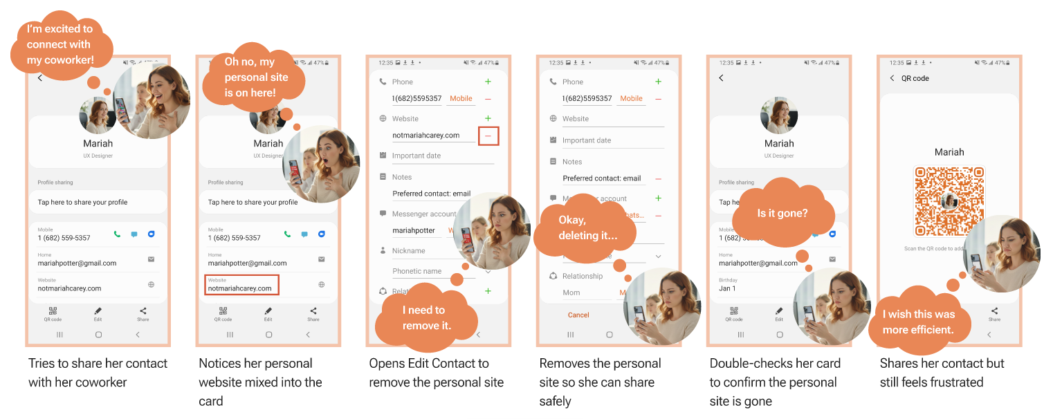
Step into the shoes of Mariah, a first-day intern trying to share her contact professionally, who accidentally reveals her personal website mixed into the same card, and has to stop and remove it before she can share safely.
Define
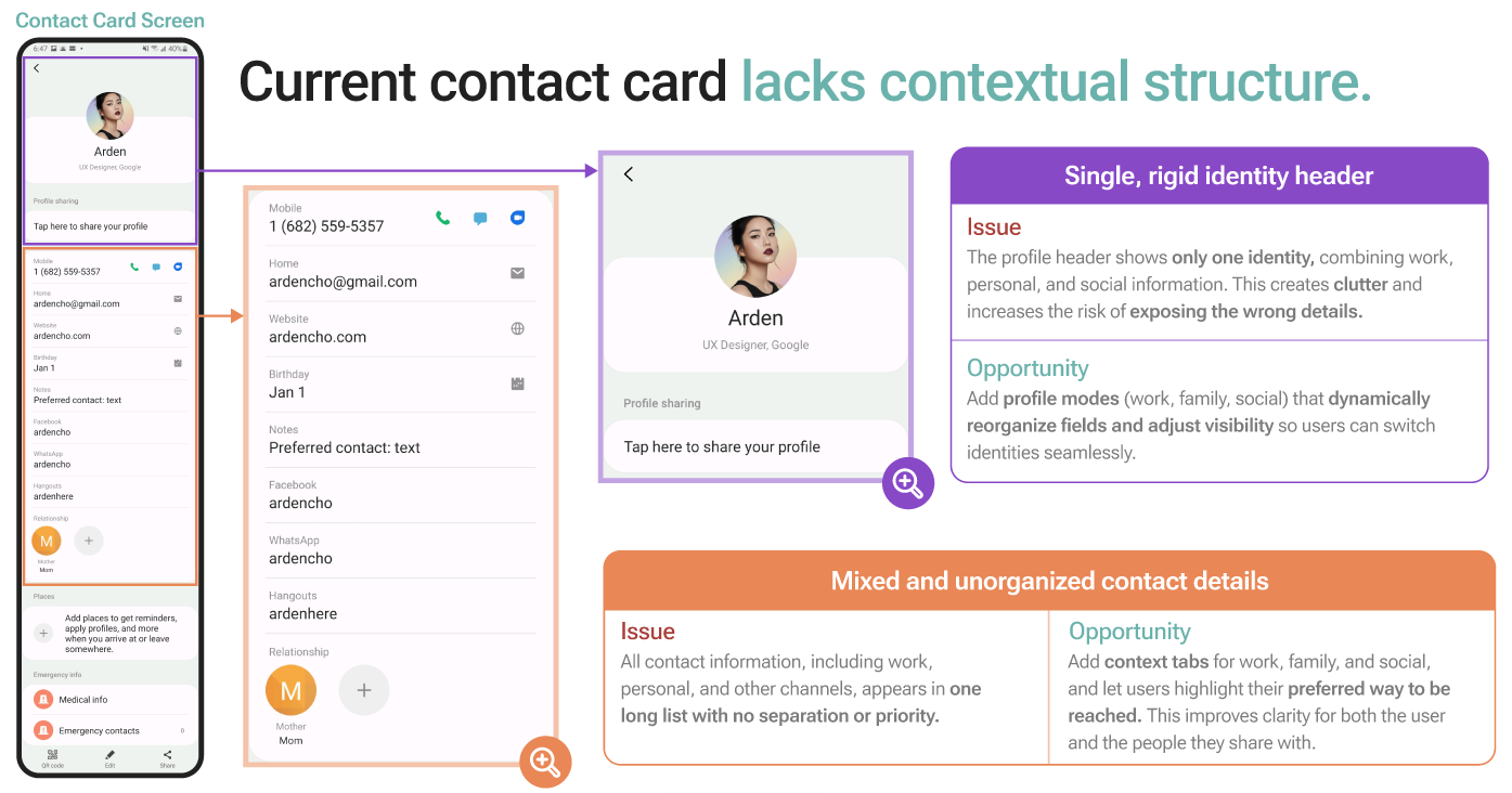
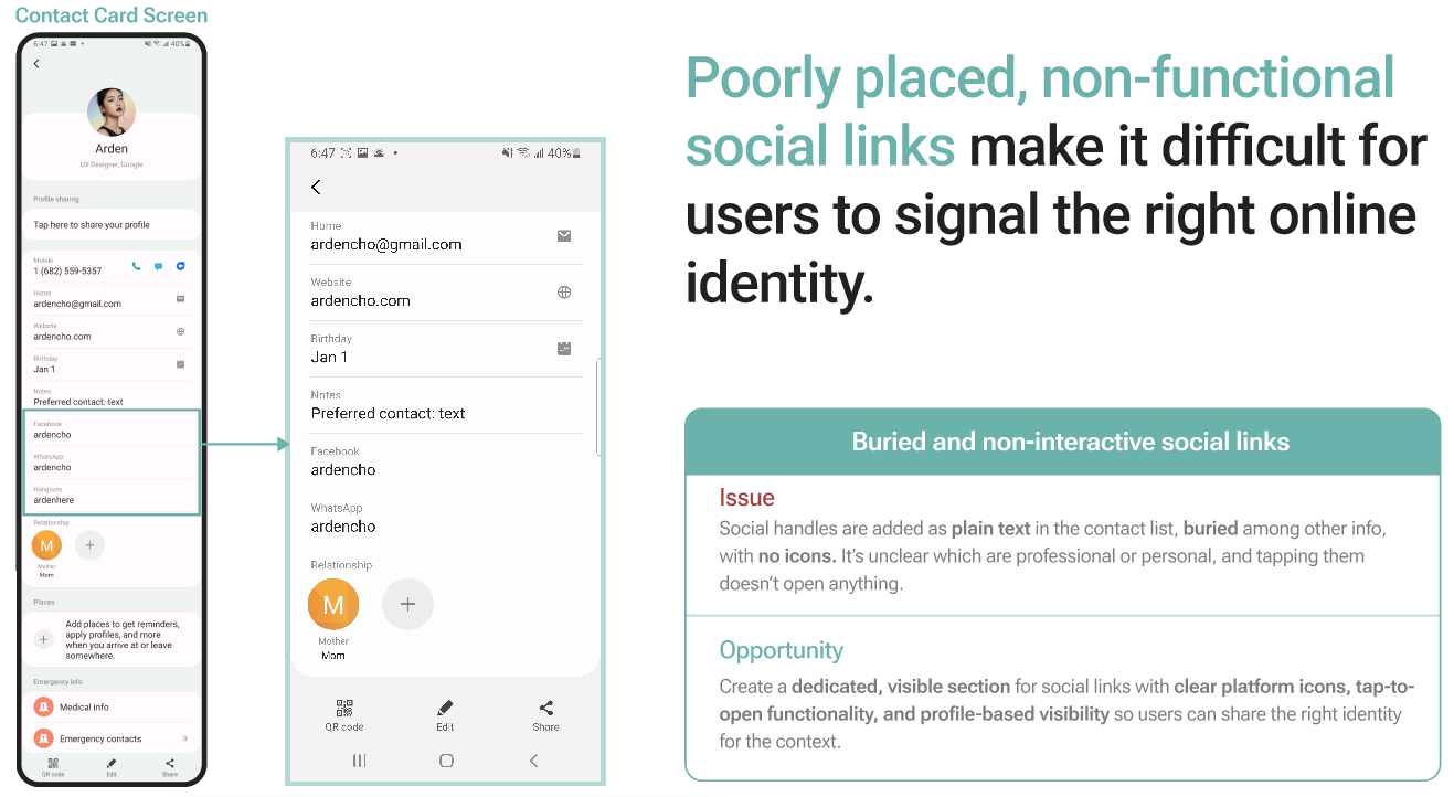
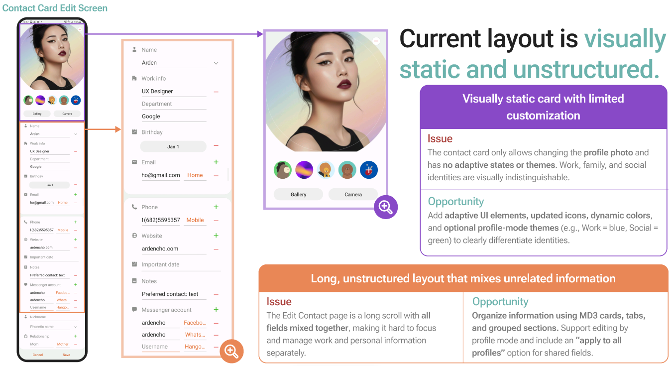
The current Contact Card mixes work, family, and social info into one rigid list with no way to tell them apart.
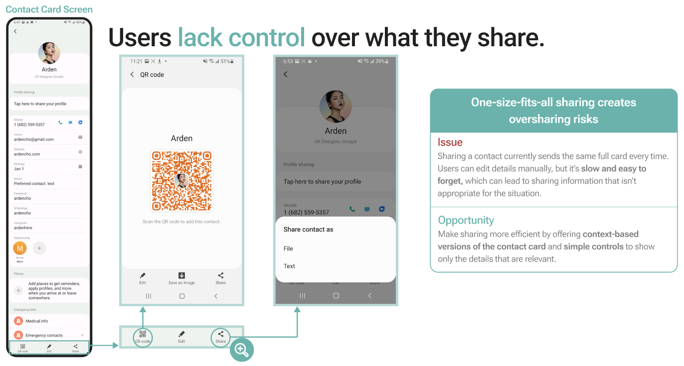
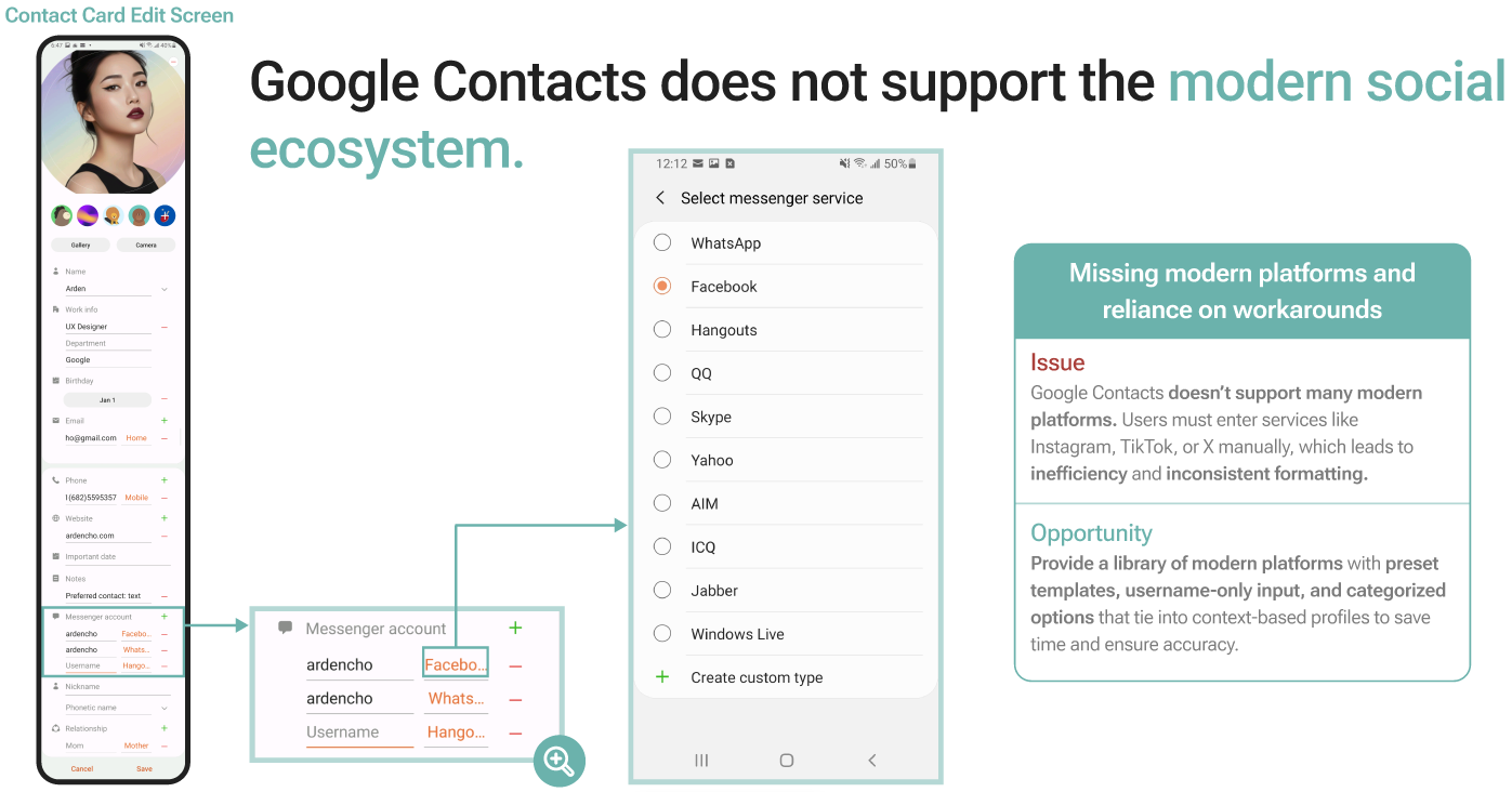
Auditing the Contact Card and Edit Contact screens surfaced five problems: one identity header for every context, one-size-fits-all sharing through a single QR code, social handles that are plain text with no icons, no support for newer platforms like Instagram or TikTok, and a static, unstructured edit screen that's hard to scan.
Research
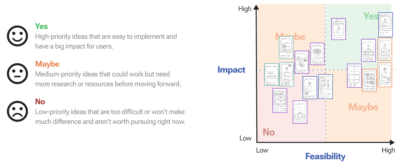
Sixteen ideas from a Crazy 8s sprint were categorized, then mapped onto an impact and feasibility matrix, narrowing down to the four features with the highest impact.
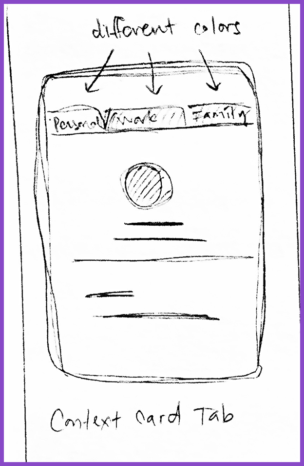
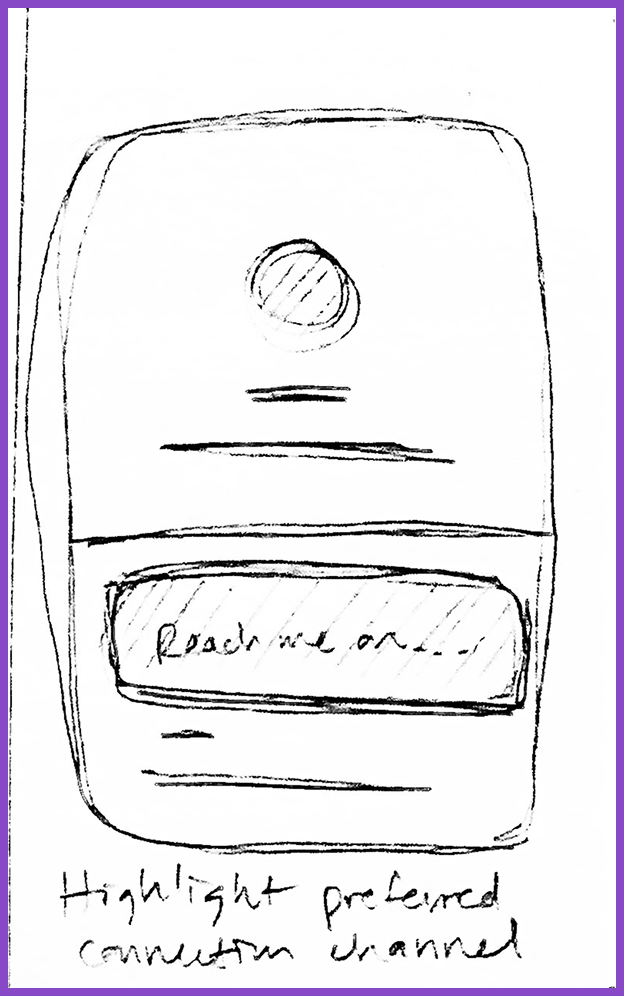
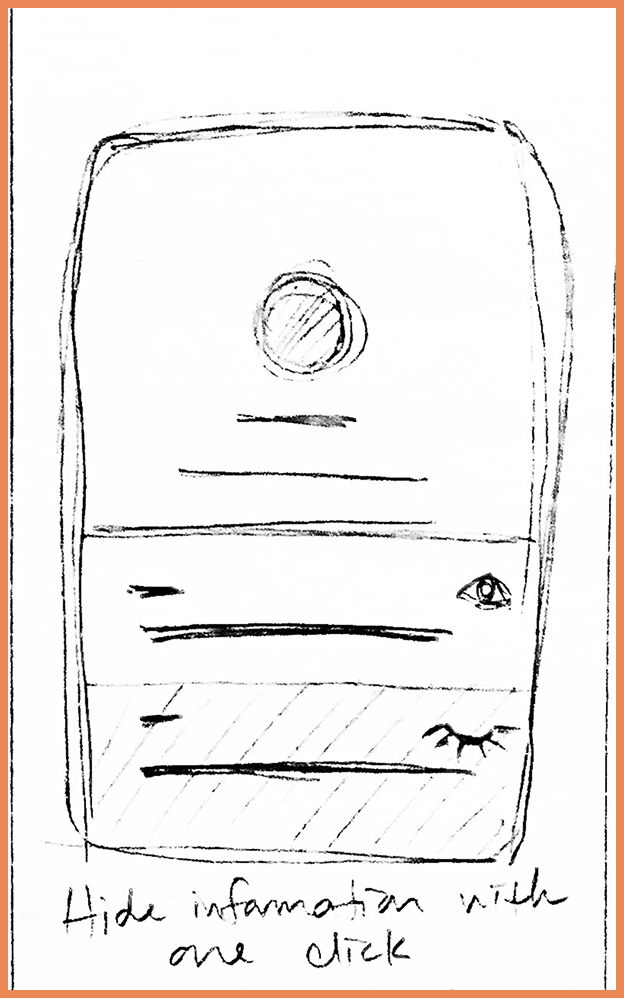
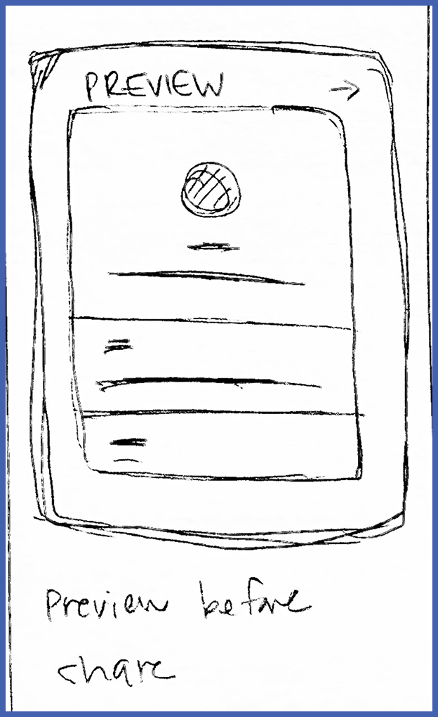
Four ideas rose to the top: profile modes via Contact Card tabs, a preferred contact channel, a one-tap hide for sensitive info, and a preview before sharing, the direction that best matched how people actually said they wanted to share.
Color-coded profile tabs for Personal, Private, and Family
A highlighted preferred contact channel
One-tap hide for sensitive info
Design
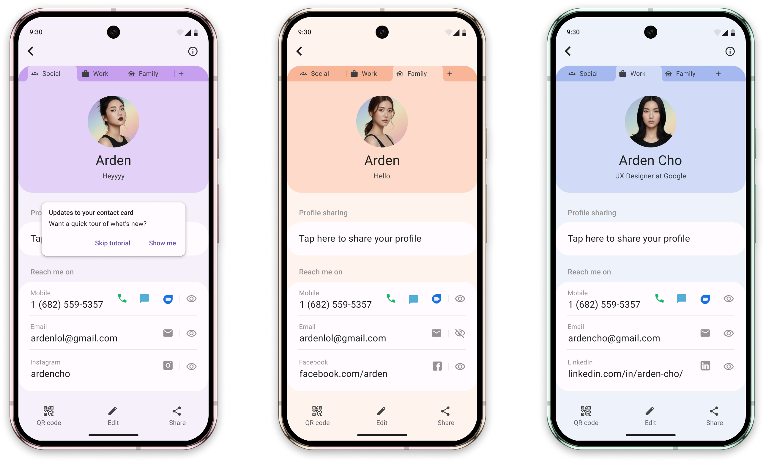
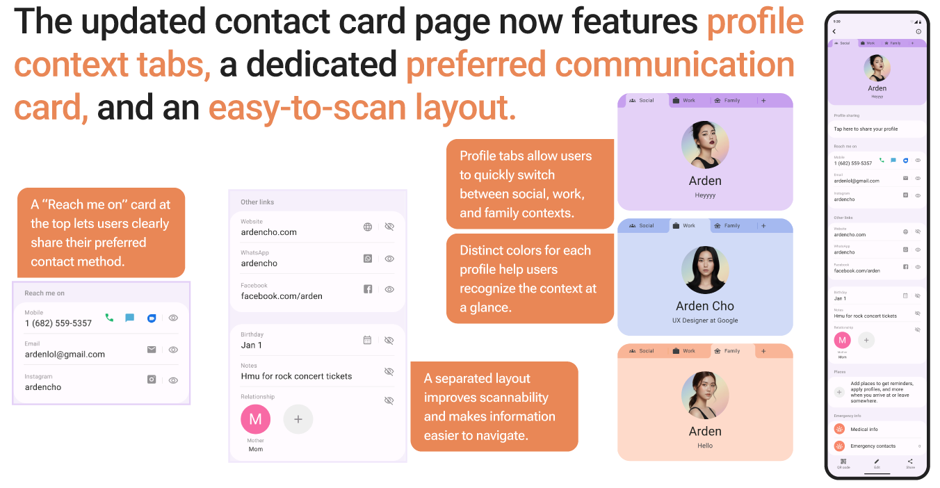
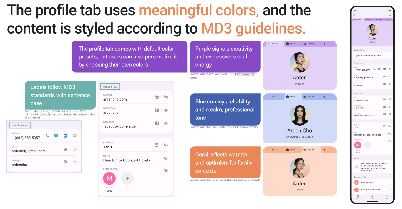
The redesigned Contact Card adds color-coded profile tabs, a preferred contact card, and a share preview, without changing how sharing already works.
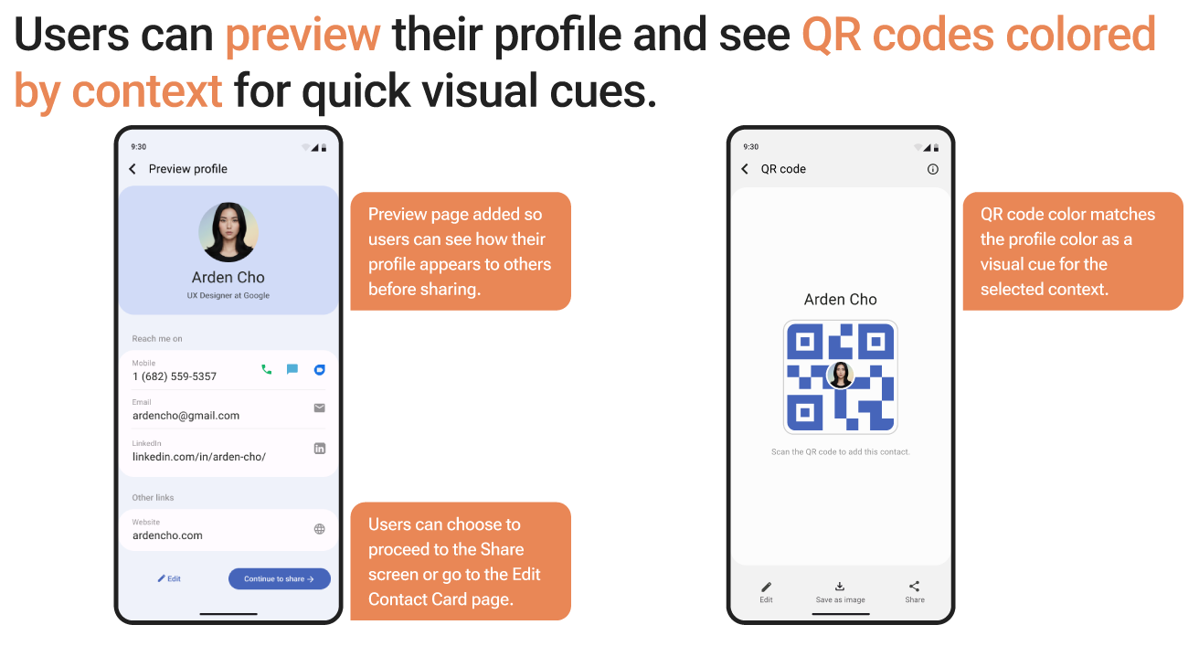
To share a contact, users open the Contact Card, select a profile mode, review what's visible, then preview and share a QR code color-coded to match, all in the same flow they already know. Work, Social, and Family tabs use Material Design 3 color presets so the context is clear at a glance, and the preview page shows exactly what the recipient will see before it sends.
User Flow
Validate
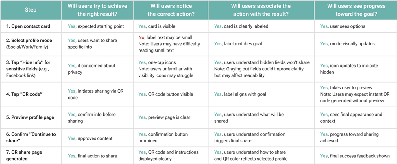
A cognitive walkthrough was conducted to identify learnability issues within the Share Contact flow.
Each step was checked against whether users would try the right action, notice it, connect it to the result, and see progress toward the goal. The only gap: the profile mode label may be too small for users to notice right away.
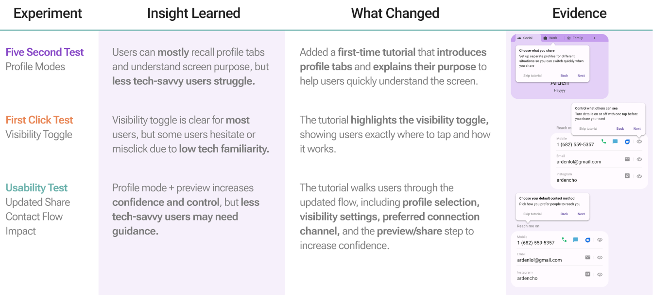
Three validation tests, a five second test, first click test, and usability test, were run with three non-designer participants with varying levels of tech comfort.
Five Second Test
Measures clarity of key elements like profile mode and the visibility toggle, to make sure first impressions are accurate.
First Click Test
Evaluates how intuitive the navigation and icon placement are, to reduce confusion.
Usability Test
Identifies learnability issues and confirms users can complete tasks without guidance.
Validation revealed usability gaps and led to guided enhancements.
A first-time tutorial was added that introduces profile tabs, highlights the visibility toggle, and walks new users through the updated flow, profile selection, visibility settings, preferred contact channel, and preview, to increase confidence.
Second-round testing with three new participants showed measurable improvements in task success, clarity, and confidence.
33%
increase in successful task completion without any assistance.
100%
of users reported feeling confident and in control while completing the flow.
32s
reduction in average time to complete the flow after viewing the tutorial.

.avif)

.avif)